
Over the years, Infinite Harmony has quietly evolved, deepening its roots in yoga therapy, wellbeing coaching and mindful living. As the work has grown, so too has its essence, becoming a space that bridges the scientific and the spiritual, the physical and the emotional, the practical and the poetic.
It felt like the right moment for the Infinite Harmony brand to evolve too, to reflect what this space now truly represents: balance, connection and the infinite flow of life itself.
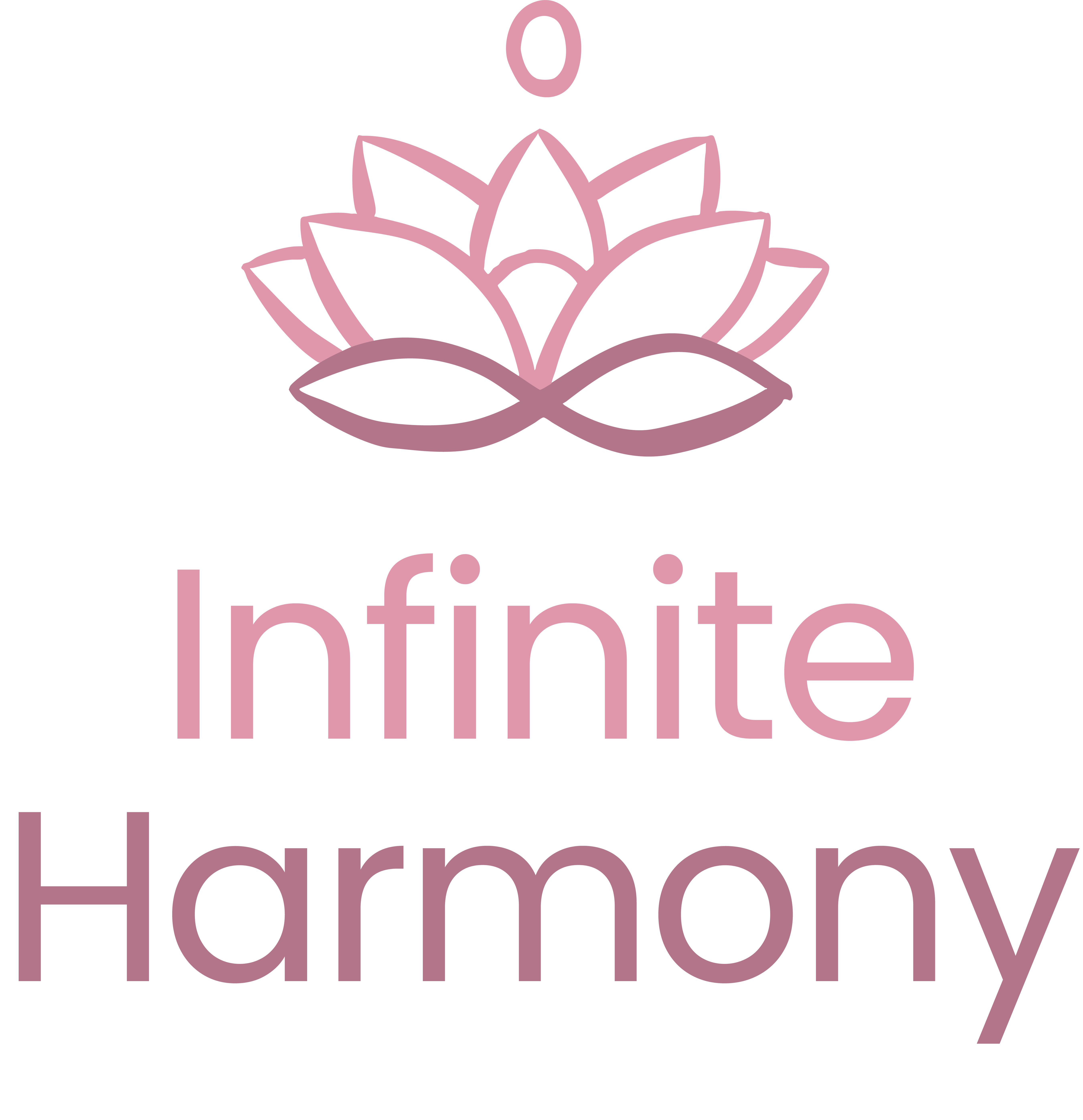
The result is a logo filled with symbolism and meaning, a visual reflection of everything Infinite Harmony stands for.
The infinite cycle of life
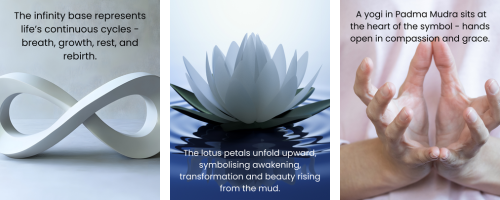
At the base of the new logo lies the infinity symbol, the source from which the entire form emerges.
It represents the continuous cycles of life, breath and renewal, the natural ebb and flow that underpins every aspect of wellbeing.
Just as the breath moves between inhalation and exhalation, or day becomes night, the infinity shape reminds us that everything is part of a living cycle, one of expansion, rest, release and return.
The unfolding lotus
From that foundation, the lotus petals rise and open outward, symbolising awakening, transformation and growth.
In yogic philosophy, the lotus represents the journey of the self, from the depths of the mud to the light above, blooming in its own time and way.
For Infinite Harmony, it mirrors the therapeutic process: meeting ourselves where we are, gently unfolding layer by layer toward greater balance and understanding.
The yogi in Padma Mudra
At the heart of the design sits a yogi in Padma Mudra, hands held in the gesture of the lotus.
This mudra embodies compassion, openness and spiritual awakening, inviting both stillness and receptivity.
It symbolises the essence of the practice, the meeting point between body, mind and spirit, the quiet inner awareness that rests beneath all movement.

The creative journey
This new visual identity was born from collaboration and care.
✨ Ben helped interpret my rather wafty ramblings about energy, symbolism and mudras, turning those abstract ideas into something graceful, balanced and deeply meaningful.
🎨Maddie, my wonderfully creative daughter, a third-year MPhys Physics student at the University of Surrey and a gifted artist, brought warmth and humanity by redrawing the design freehand, softening its lines and adding an organic flow that feels truly alive.
Together, they have created something that perfectly captures Infinite Harmony’s spirit: grounded yet expansive, structured yet soft, a gentle reflection of harmony itself.
A symbol of connection, balance and wholeness
The new logo is more than a design. It is a reminder that harmony is not a fixed state, but a living, breathing practice.
That we are always cycling through moments of rest and renewal, stillness and change.
And that every unfolding, every breath, holds the potential for transformation.

This is the heart of Infinite Harmony.
A space where science and spirit meet,
where compassion and clarity coexist,
and where every person is supported to reconnect with their own innate balance.
Welcome to the new look of Infinite Harmony, the same essence, lovingly renewed.


